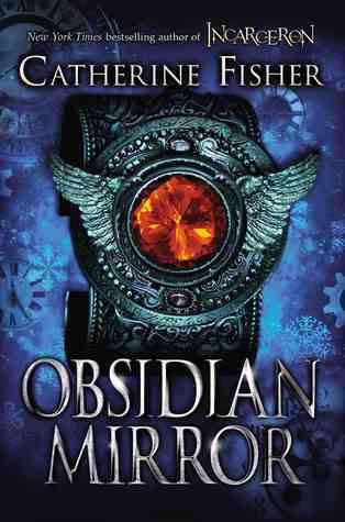
Obsidian Mirror by Catherine Fisher
Just. blah. Too odd, too much, too close.

A Light in the Wilderness by Jane Kirkpatrick
Washed out. That model might not even be black, it's hard to tell. Just boring.

Speak by Nish Weiseth
Why the fake worn cover? I could think of several better ideas

The Word Exchange by Alena Graedon
This novel has stayed with me a loooong time. I wish the cover could be given a second chance, so that it may entice others to read it's awesome-ness.

Beyond the Pasta by Mark Leslie
Um. No. Don't bore me please. Why the old painting?
Not the worst out there, by any means, but not my favorite from what I read this past year. I think covers are an important aspect in the decide to read factor. Would you read these? What were your least fave covers in 2014?


I definitely agree on the Obsidian Mirror cover, it looks really odd and I wouldn't pick it up! I quite like the cover for A Light in the Wilderness, but I guess that's a difference in taste thing. It's always interesting to see whether the book's cover and content match in your opinion! Interesting post :)
ReplyDeleteJuli @ Universe in Words
Yeah, I can't say any of these is really drawing me in. The Word Exchange isn't bad, but it isn't jumping out either.
ReplyDeleteUhm blech. Whenever I see bad cover designs, I never blame the designer. Designers usually know what to do. It's people who are trained in other things (editing, publicity, shareholding, cough cough) that get their hands in the design and start messing things up. bad bad bad.
ReplyDeleteLet's just say the whole team let us down :)
ReplyDelete