Sometimes....they just don't work. Covers don't always draw you in. Or, too frequently, they depict something that doesn't fit with the story. In no particular order, these are the covers from books I read in 2015 that could use a redo:

How (Not) To Fall in Love by Lisa Brown Roberts
I actually enjoyed this read, but not this cover. The figures are so stiff...and odd.

Crazy Little Thing Called Love by Beth K. Vogt
There is far too much writing on this cover. I would at least remove the lengthy quote at the top. Add in the photoshopped bouquet and this is just not working.

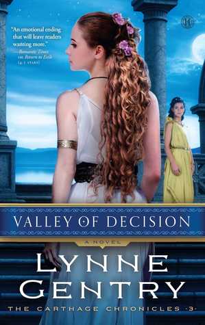
Valley of Decision by Lynne Gentry
That's some nice, long, photoshopped hair. I just think this one could have better depicted the story.

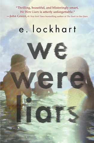
We Were Liars by E. Lockhart
I suppose this was the best scene they could pick without giving away spoilers, but it is too washed out and BLAH. Maybe something graphic, bright colors on a black cover?

Five Times I Met Myself by James L. Rubart
I assume they were going for a 'Tuesdays with Morrie' kind of vibe. The shadow is supposed to add a bit of mystery...but no. I wouldn't pick this up based on cover alone.

Throne of Glass by Sarah J Maas
This is the cover of the version I read. Thank goodness they have since updated it!

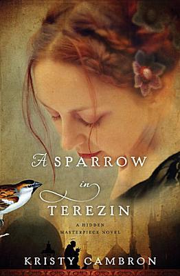
A Sparrow in Terezin by Kristy Cambron
This one is more of a letdown really. The fancy hairdo and flowers don't match with the concentration camp vibe (although pretty). But the obviously fake and last second bird? No thanks.

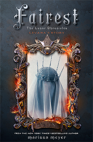
Fairest by Marissa Meyer
Yup. Just generally not impressed. The mirror is on fire?? The font? It just doesn't match the other covers in the series which irks me.
What did you think about the covers on this list? Which books would you add from 2015??


No comments:
Post a Comment