
Note: These are from books I read in 2014 and not just published in 2014, although all but two were. Also, just because it is one of my favorite covers, doesn't mean I liked the story! Proceed with caution....
10: 
Colors I love AND cupcakes? Count me in any day!
9:
Puffy white dress? That title 'coat-of-arms'? I know I'm in for a FANTASTIC romance!
8: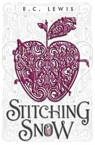
The pink against white is what first caught my eye on Netgalley. The extensive design is just perfect and really reflects the story
7:
A cover like this will always make me excited to read fantasy!
6:
I only had an egalley of this title, but boy howdy would I love a hardcover!! FRAME THIS
5: 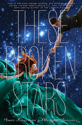
This cover is a perfect of example of getting it right. The lettering, the placement, that dress....tell me I'm wrong.
4: 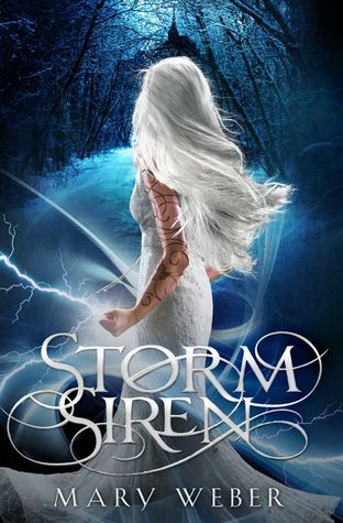
The hair, the dress, the markings. The only thing better than this cover is it's incoming successor.
3: 
I was really excited about the cover's promise of futuristic ballet meets a little Black Swan. The cover calls me in, but the story had me backing out.
2: 
This cover just drew me in like a moth to flame. I'd define these colors as 'hipster'.
1: 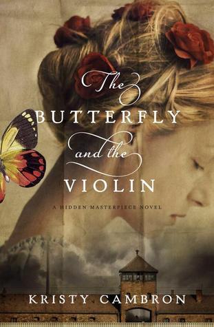
The perfect cover. It describes the mood, tone, story, everything. Perfect.
I'll be wrapping up my Review of 2014 posts next week with some *poopy* covers, which I managed to keep to a minimum. Until then: do you have some favorites from this list??
So pretty *-*
ReplyDeleteI love all of them!! :)
(PS I love Betsy St. Amant! I didn't know she had a new book out. *mad dash to add book to TBR list* Have you read Confessions of a PK (also by her)? It's pretty cute. :D)
Thanks for sharing, and I hope you have a lovely weekend! ^-^
I haven't read anything else by her yet, but she is gosh darned cute and the book was good. I'll have to find it at the library!
ReplyDelete